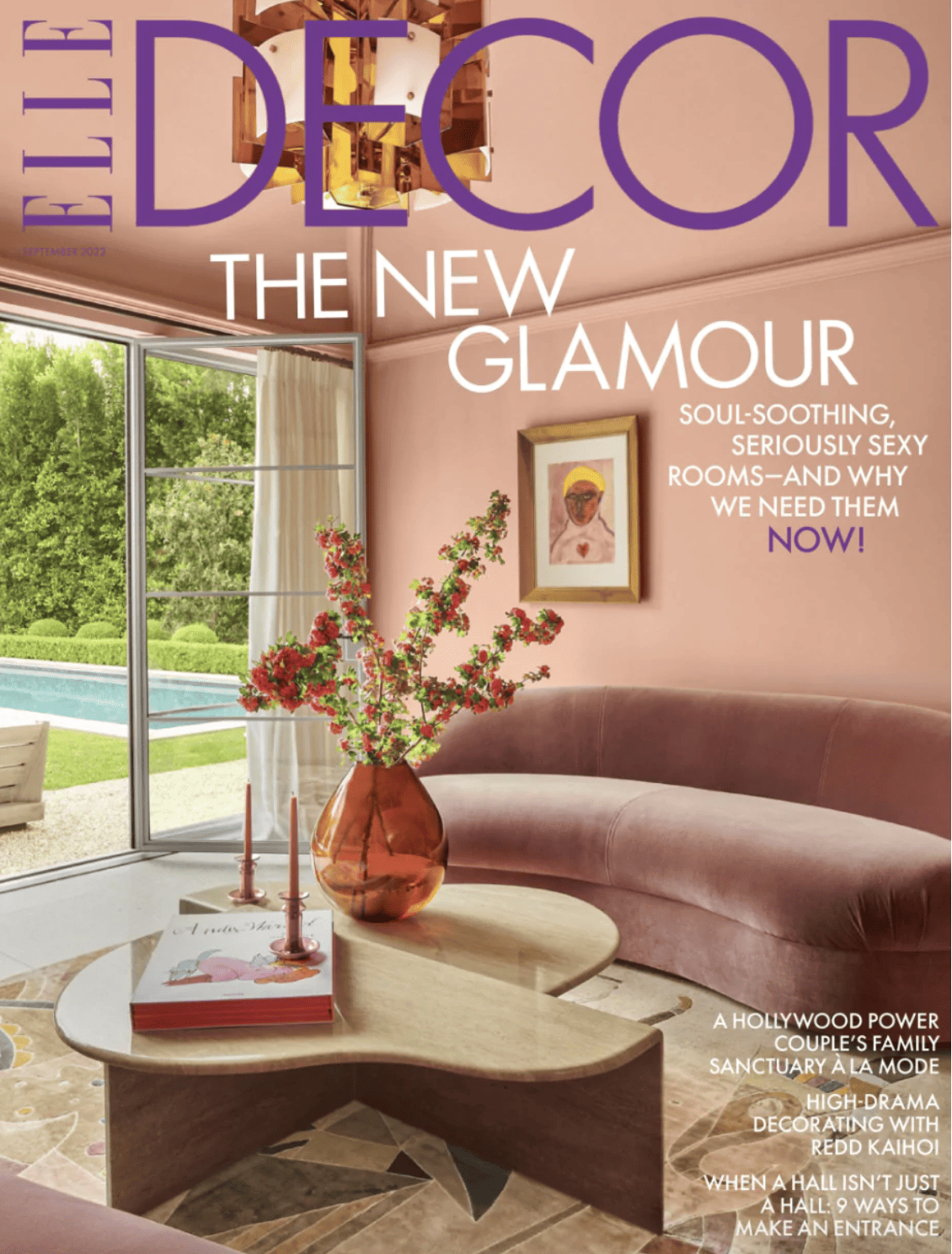
Anyone else loving Elle Décor’s Front Cover pic this month? I absolutely adore it!!!
Its soothing, calming and inspiring, classic yet modern all at the same time.
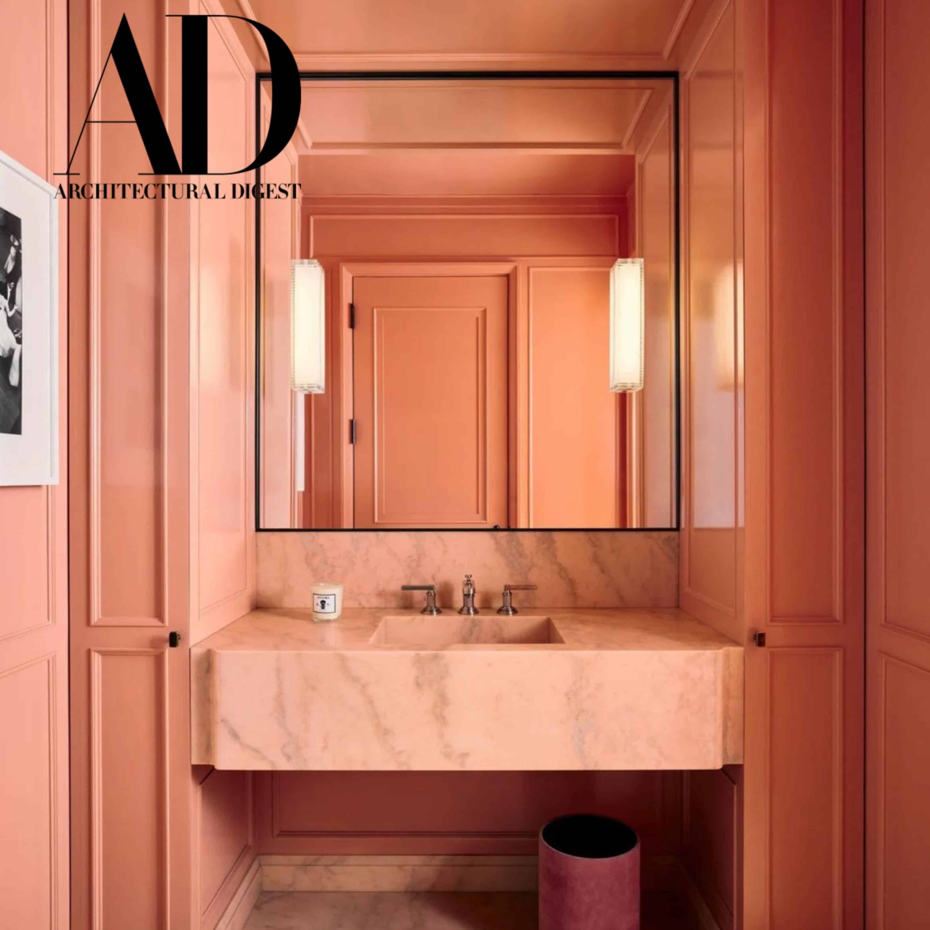
But then as I flipped through some more magazines, I spied some yet more Peach Perfection in the pages of Architectural Digest.
So it shouldn’t come as a great surprise that WGSN has picked Apricot Crush as the Color of the Year 2023/2024. They call it Apricot Crush.
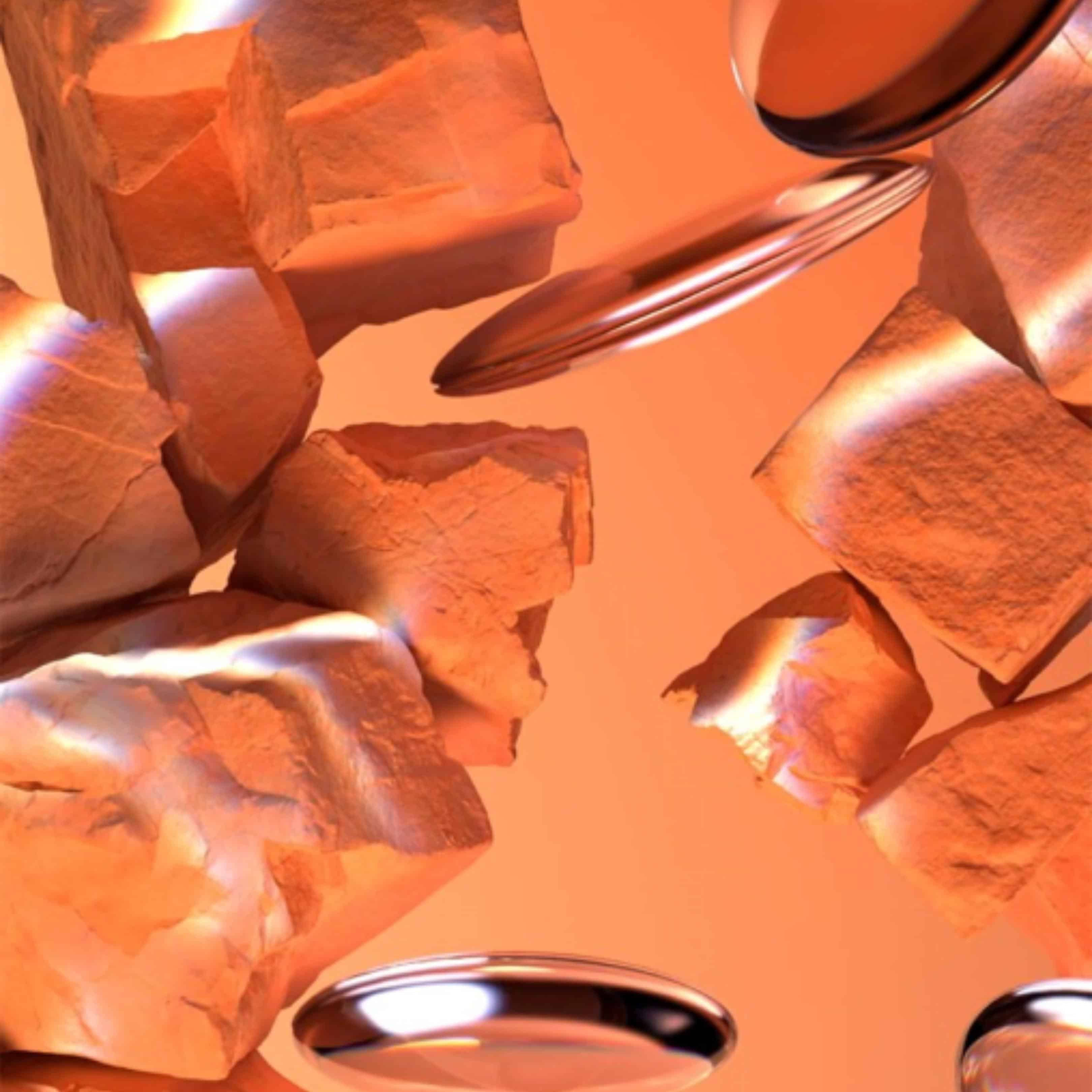
Over the years, I have called it Salmon, Flamingo. Melon, Coral or Peach but Apricot Crush sounds far sexier. Whatever the name, I can’t think of a more perfect choice to lift our spirits.
This Happy Hue has the warmth of red, the carefree sense of orange and the romance of pink. It is fresh and warm at the same time. Red is too harsh, pink too feminine, orange too playful but “Apricot Crush “is just perfect . It is my goldilocks colour: not too hot, not too cold: it is just right.
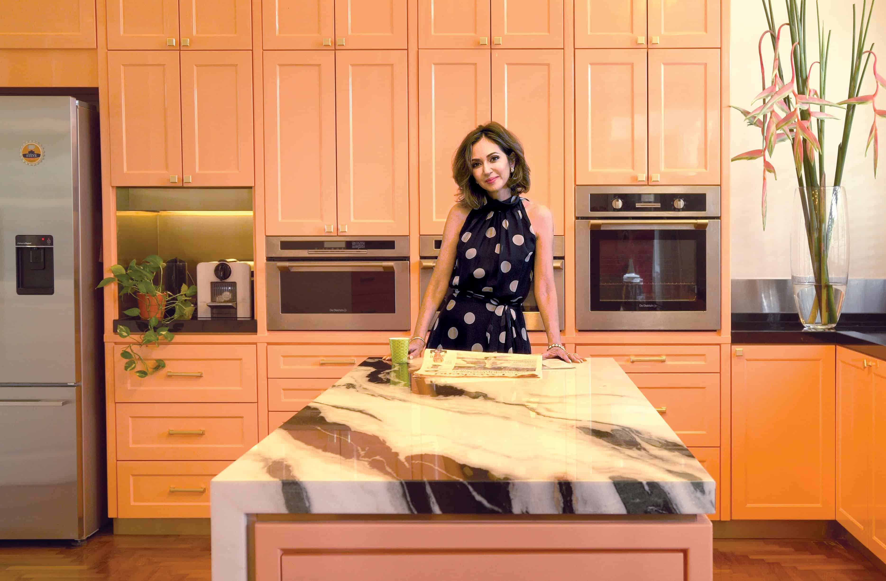
During the lockdown, when we were all in need of an instant mood boost, I transformed my kitchen with a lick of paint and enjoyed an instant dose of happy energy.
Click this link to see more of this Happy Chic Kitchen
![]()
![]()
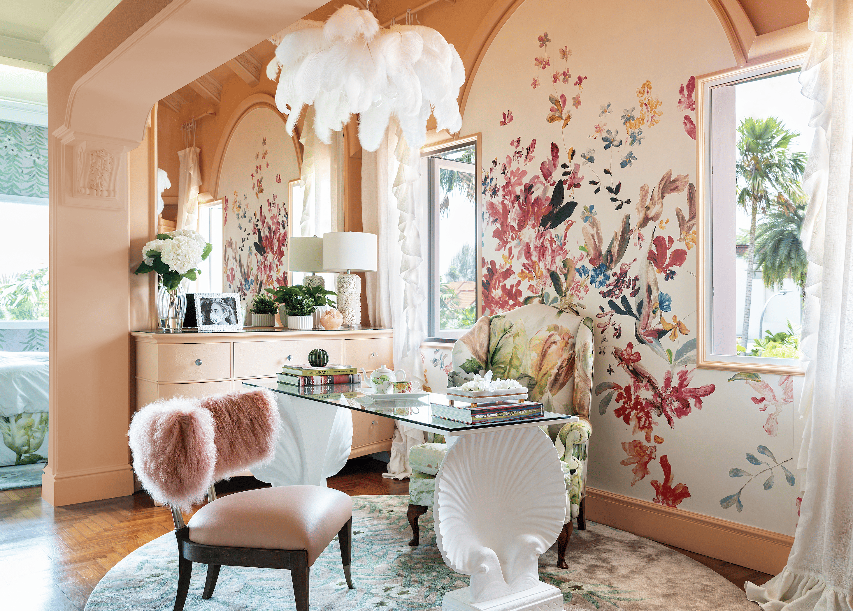
I loved it so much that, earlier this year, I decided my WFH space needed a lift too.
Not ready to commit so much?
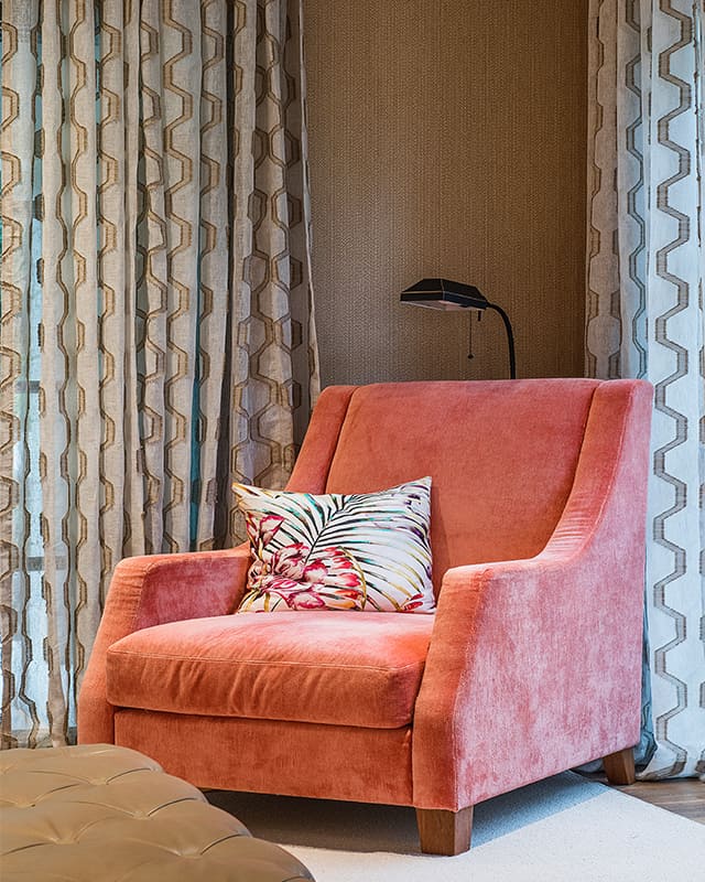
Just a touch of this happy hue can be enough to lift your look. Check out this reading nook, I designed a few years ago.
Click HERE to see more of this award winning Singapore home.
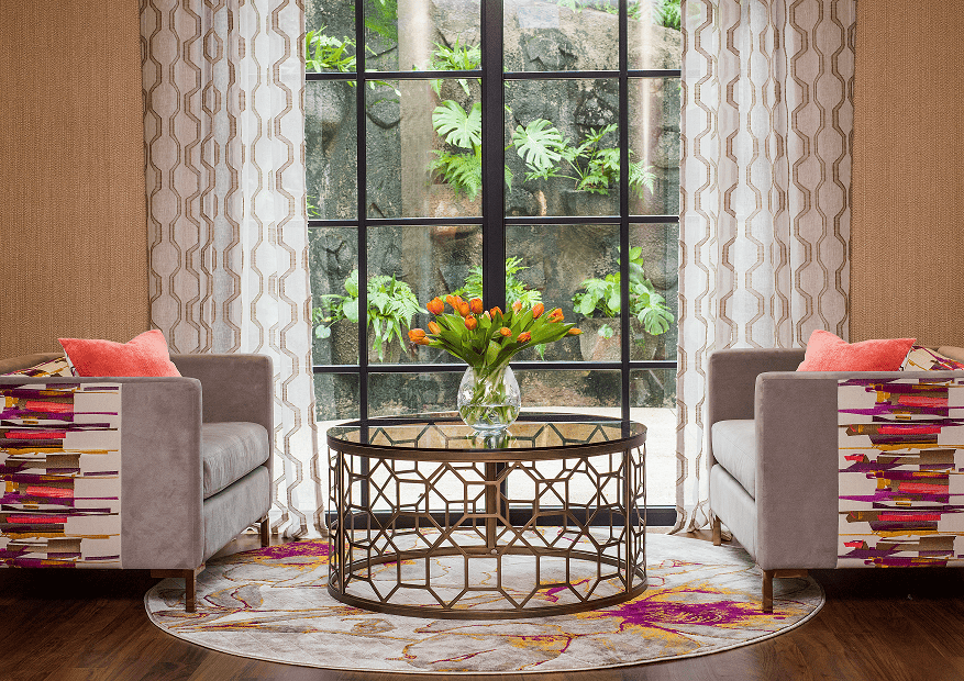
In the same home, we covered a large armchair in coral. What a perfect spot to curl up with a morning cuppa and a good book: you can just feel the cosiness.
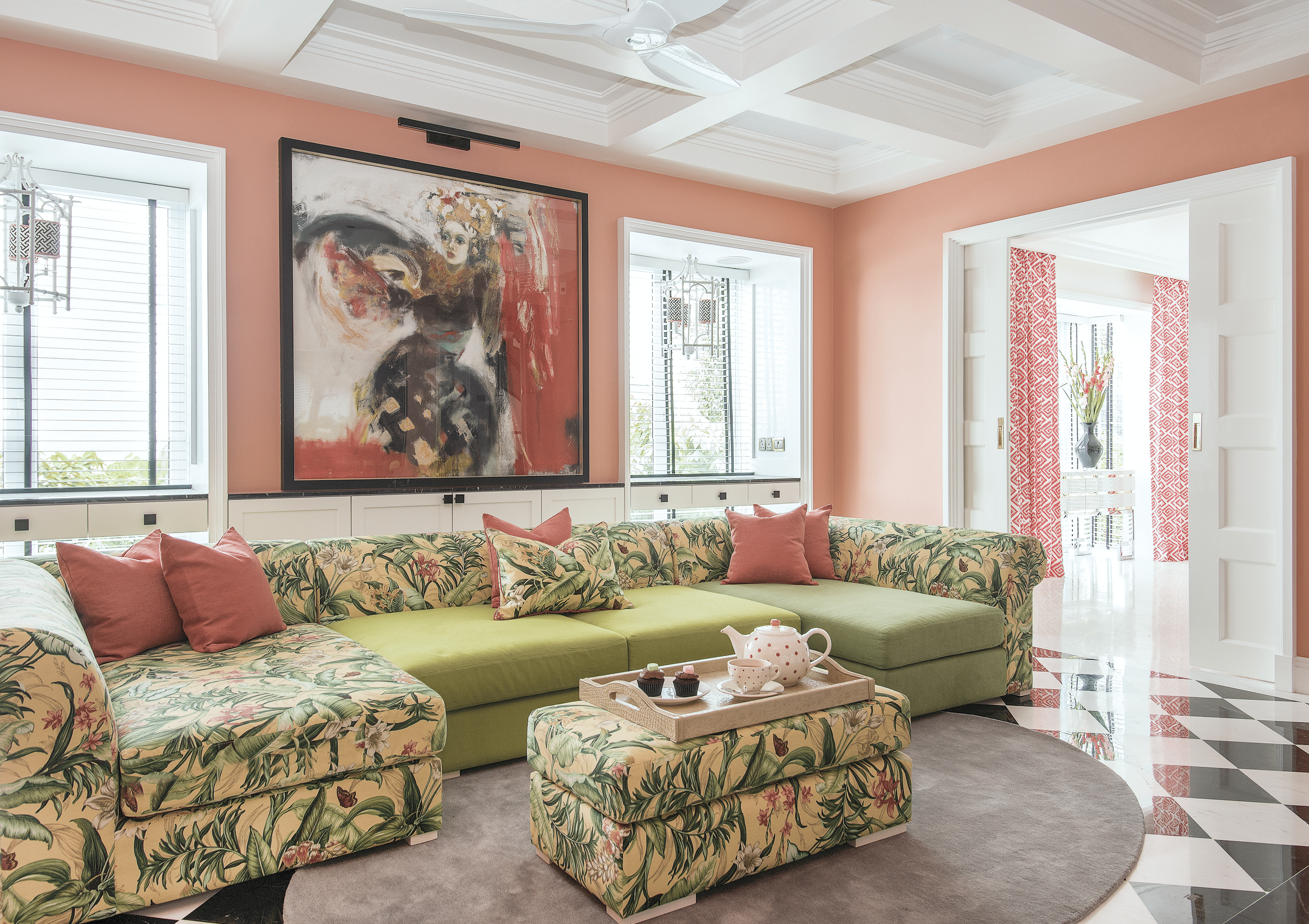
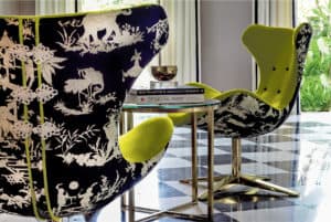
So versatile, Apricot Crush can be used anywhere and everywhere and throughout the home. Mix it with lashes of white to keep the look, light and fresh.
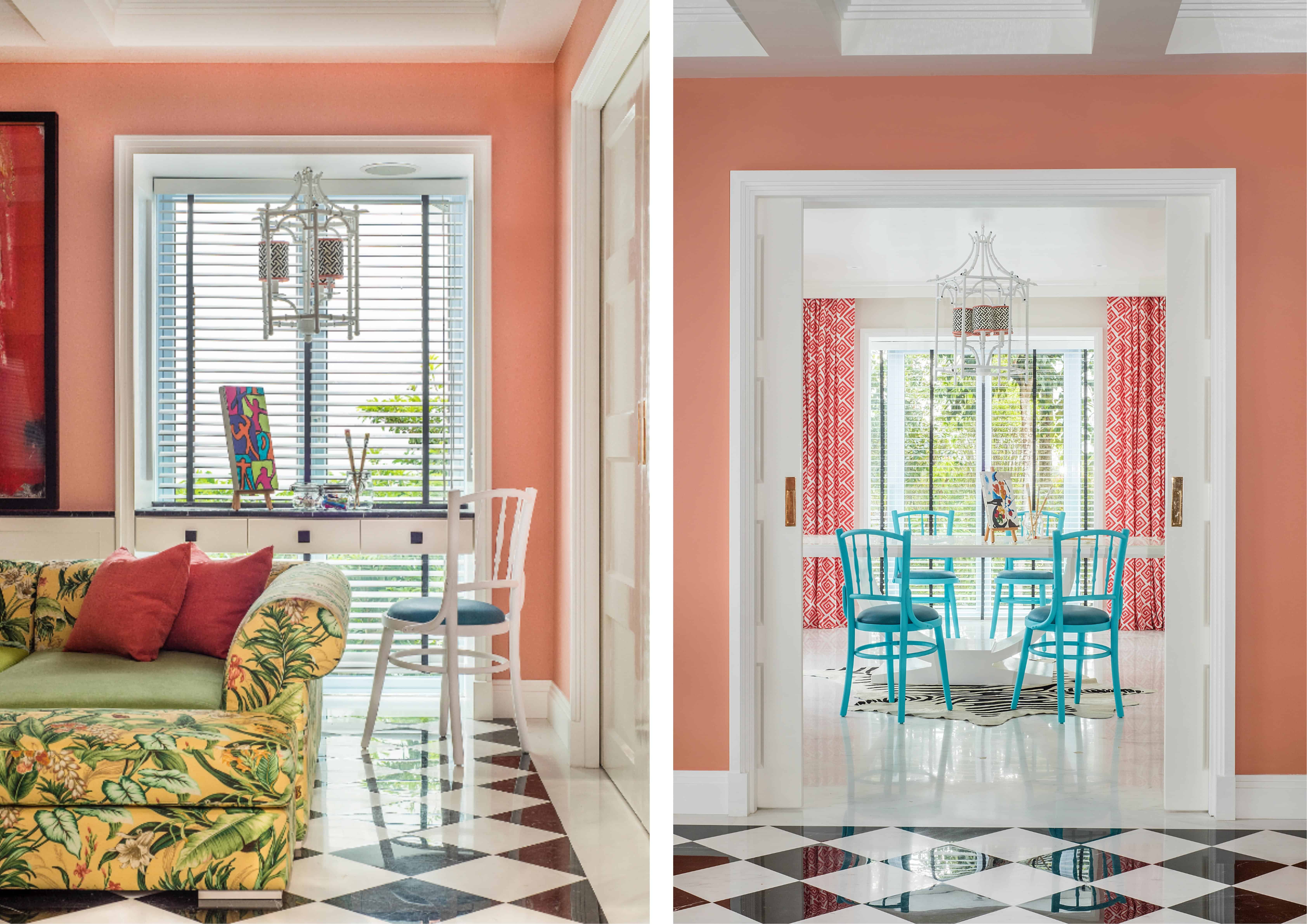
Feeling a bit more adventurous? Try enveloping the whole room with this cheerful colour. Can’t you just feel the joy?