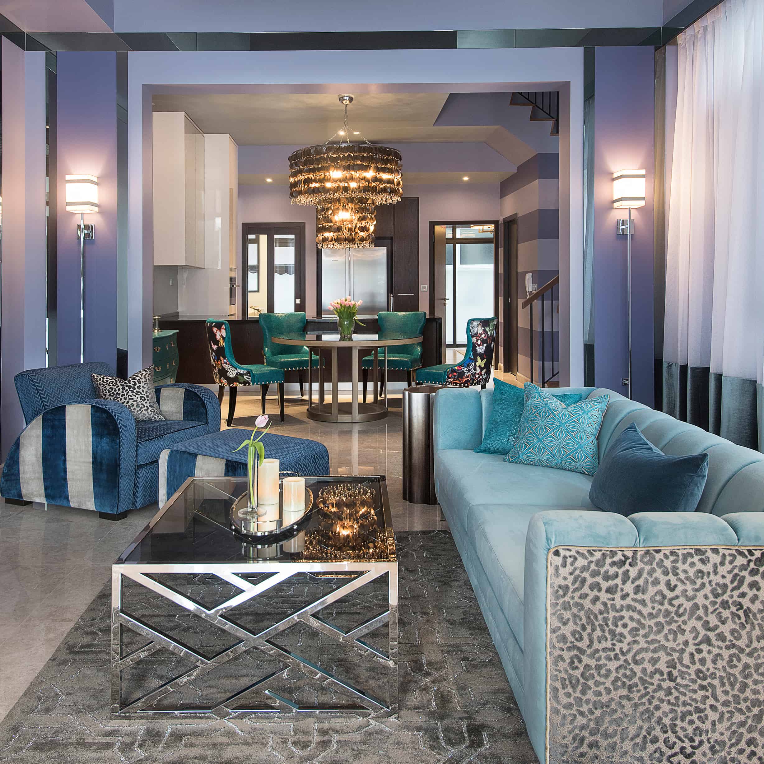
At Design Intervention, we are well known for our use of bold colour to fill a home with fun and vitality. But we often work with pastel tones too, especially when we are trying to create a a feeling of serenity and relaxation.
So often thought of as suitable only for kids spaces, pastel decor schemes can also be sophisticated but in a softer, gentler way than stronger coloured rooms.
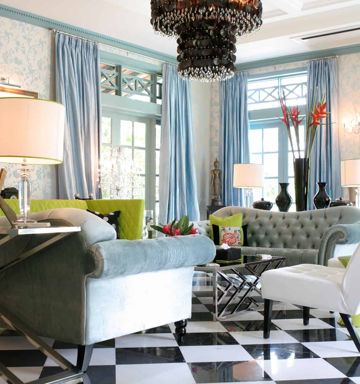
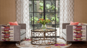
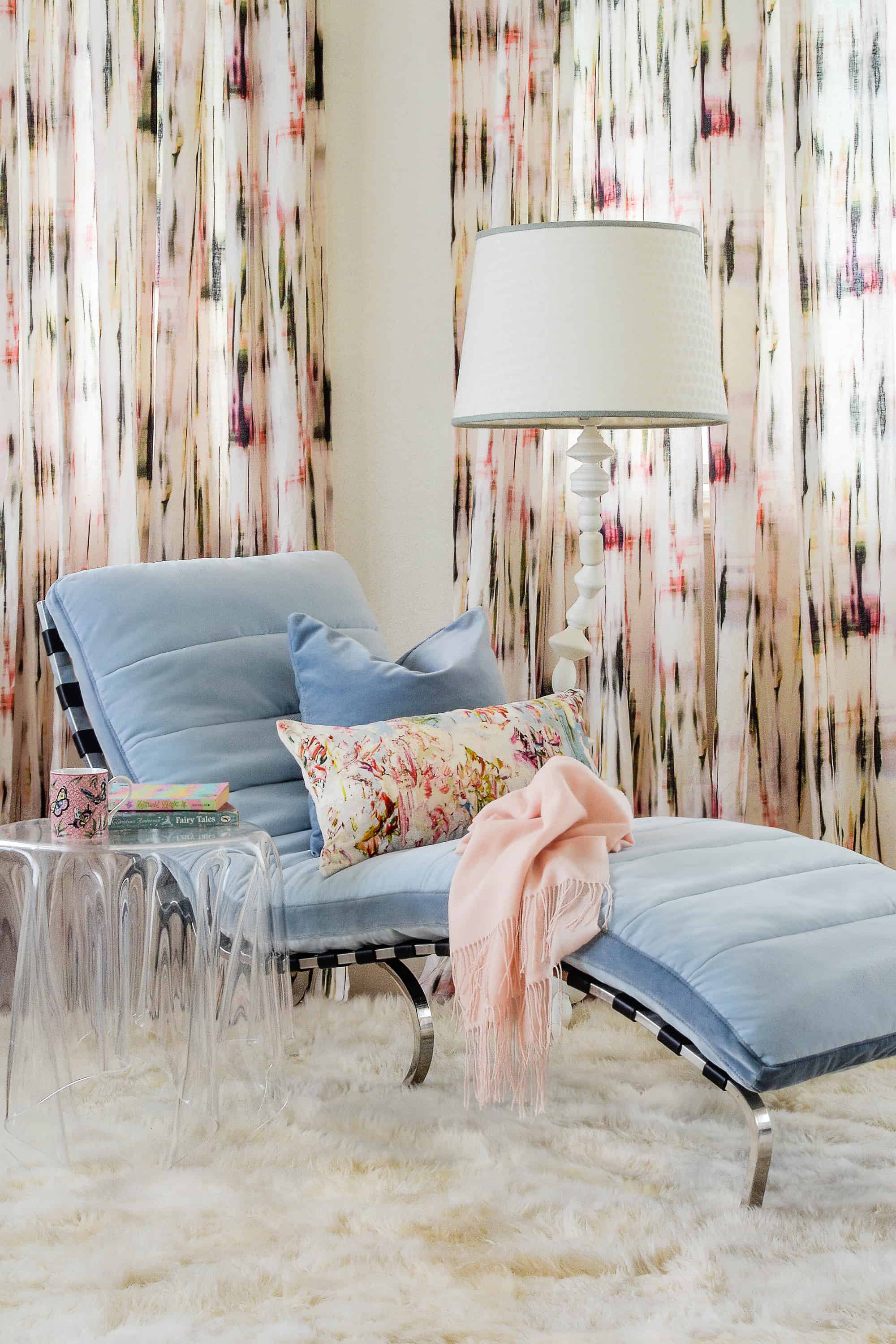
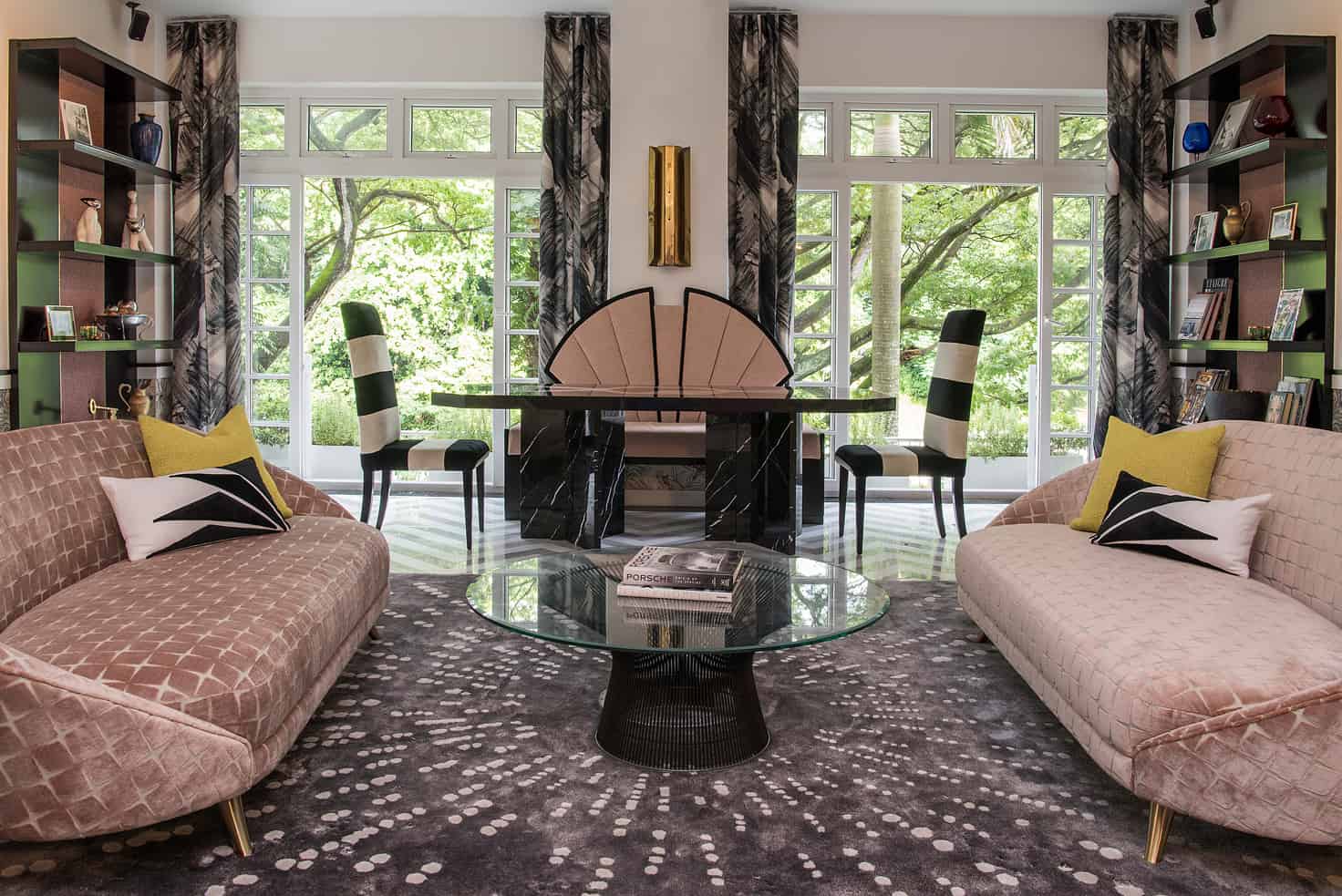
Adding touches of black, ensures a confident, grown-up vibe and prevents sorbet tones from becoming saccharine sweet.
In hot and humid Singapore, I often suggest pastel tones for rooms that get a lot of direct sun – pastel shades are like a cool breeze on a scorching day.
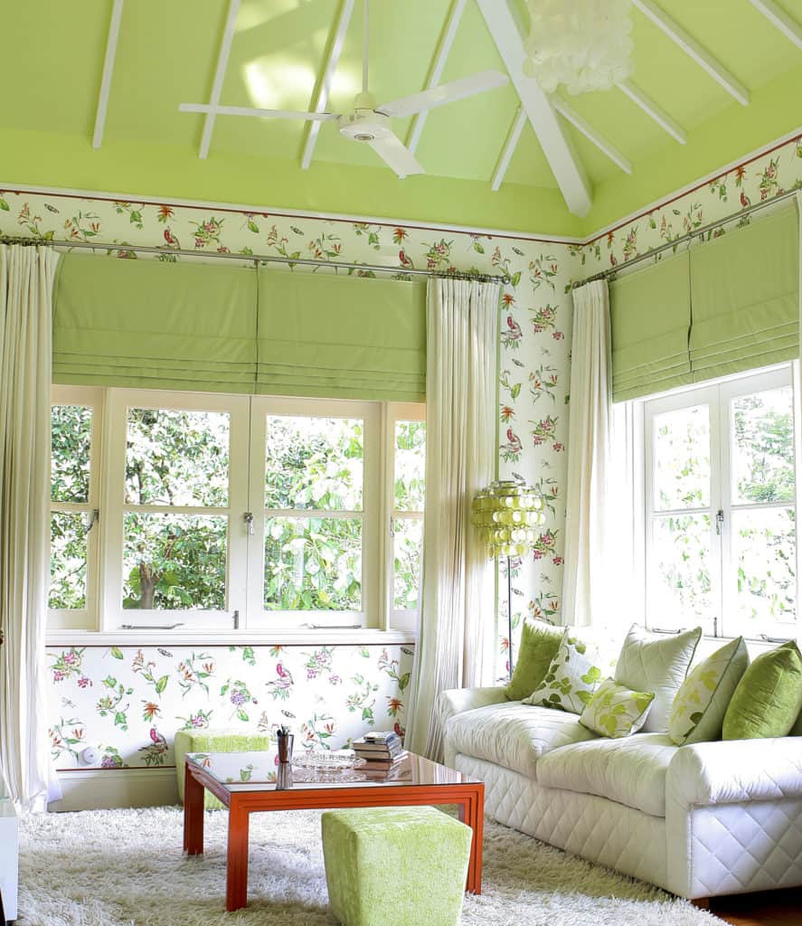
Pure white, amplifies light which can makes sunny room seem even hotter. But nothing cools down a room like a wash of pastel or a shade of sorbet. So next time the temperatures rise, look for inspiration at your favourite gelateria strawberry ice, placid pistachio, balmy blueberry or perfect peach… these hues just ooze a cooling serenity.
It is one of my design secrets.